Friday, 13 March 2015

Places My Texts Will Feature.

Digipak

I'd have my digipak sold in retailers like: HMV, Asda and Tesco nationwide. I'd also have my Digipak feature in local stores like Spin It Hull and Sound System Records. This will allow my product to easily circulate around the country at an affordable cost.

Globally, my product would be distributed through online stores for delivery like Amazon and Play.com. Having these worldwide links means that globalization can be easily achieved.

Advert


My advert would be featured in music magazines like NME, Juxtapoz, Mixmag and DJ Mag. Perhaps it would be featured in my AS coursework music mag 'Street' which focuses on Hip-Hop culture. Having my product advertised in a range of magazines means that the audience reach is far bigger.
Other places my advert might feature would be on bus stops and websites, targeting potential audiences wherever they are.


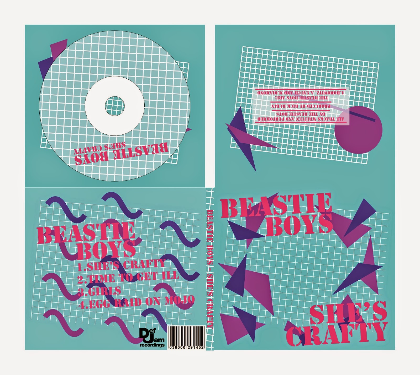
Digipak

Four Panel Digipak


Six Panel Digipak


I made the 4 and the 6 Panel Digipak because I wanted to have a special two versions. One normal ep and one with the video. This would be released at the same time, allowing consumers two options when purchasing the ep. The standard ep would be cheaper and the video ep would be more expensive than the latter.

Magazine advert

This is a Rough box diagram for the advert, based on the Blink-182 'Neighborhoods' advert.
I chose this layout as it was simple, with little text. I feel that this design is effective as it is straight to the point and is easy to read. This design also allows for the artwork to be clearly displayed so that audiences will easily recognise the album in stores.


Monday, 9 February 2015

Creating A Logo


This is the original Beastie Boys logo from the 1986 album 'Licensed To Ill' The logo is bold and stands out. It is easily recognisable from a distance. The logo takes on the geometric style of the late 70's/early 80's that takes root from African patterns and style that were worn by many different artists of the time
 - like De La Soul

and A Tribe Called Quest


Here I took inspiration from this typical 80's bright, geometric pattern and began to create this logo. 


This is the design I came up with, based on the 80's geometric pattern. I like the design as it is bold and eye catching, which is the effect I am trying to achieve. I also like it because it has a nostalgic tone that older audiences will recognise. However, I think that there needs to be at least one other colour in the design to add some variety as there is a lot of pink here.


Wednesday, 4 February 2015

Poster Design

This is a rough idea for the my ancillary poster. The idea is that the items that are stolen from the Beastie Boys in the song are shown on the poster, but as outlines - to show they have been stolen and are missing. I am not too sure on this design, and may change it to something a bit more stylish and fits in with the 80's theme I'm going for.


Tuesday, 3 February 2015

Ancillary Text Ideas

Original Cover


My Interpretation of the cover.
The image here is taken straight from the video. I do not plan to use this image in the final product, this is just for design purposes